Project overview
Smart Tenant is a mobile app exclusively designed for Smart Living Properties – Ottawa's property management company. It allows tenants to seamlessly connect with their local neighborhood, engage in hassle-free buying and selling, and stay in touch with the building management.
At-a-Glance
During the period from May 2022 to January 2023, I had the chance to lead the UX/UI design process for the project in collaboration with the development team at Algonquin College Data Analytics Centre. From conducting immersive UX research to creating wireframes and high-fidelity mockups, I owned every stage of the design process. The objective was clear: develop a mobile app to enhance tenant engagement, complemented by a user-friendly admin portal for streamlined content management. Over the course of six months, I successfully delivered a comprehensive set of responsive web designs for the admin portal, a visually captivating mobile app design, and a detailed design system. Working closely with the development team, we transformed these designs into an award winning product.
⏳ Timeline: May 2022 - Jan 2023
👩💻 My Role: Lead UI/UX Designer
👥 Collaborations: 1 Project manager, 5 software developers
🖌 Platform: Figma, Miro
🤔 Problem
Through extensive research conducted by our client, Smart Living Properties, it became evident that tenants were seeking a solution to enhance their sense of belonging and connection within the community.
💡 Solution
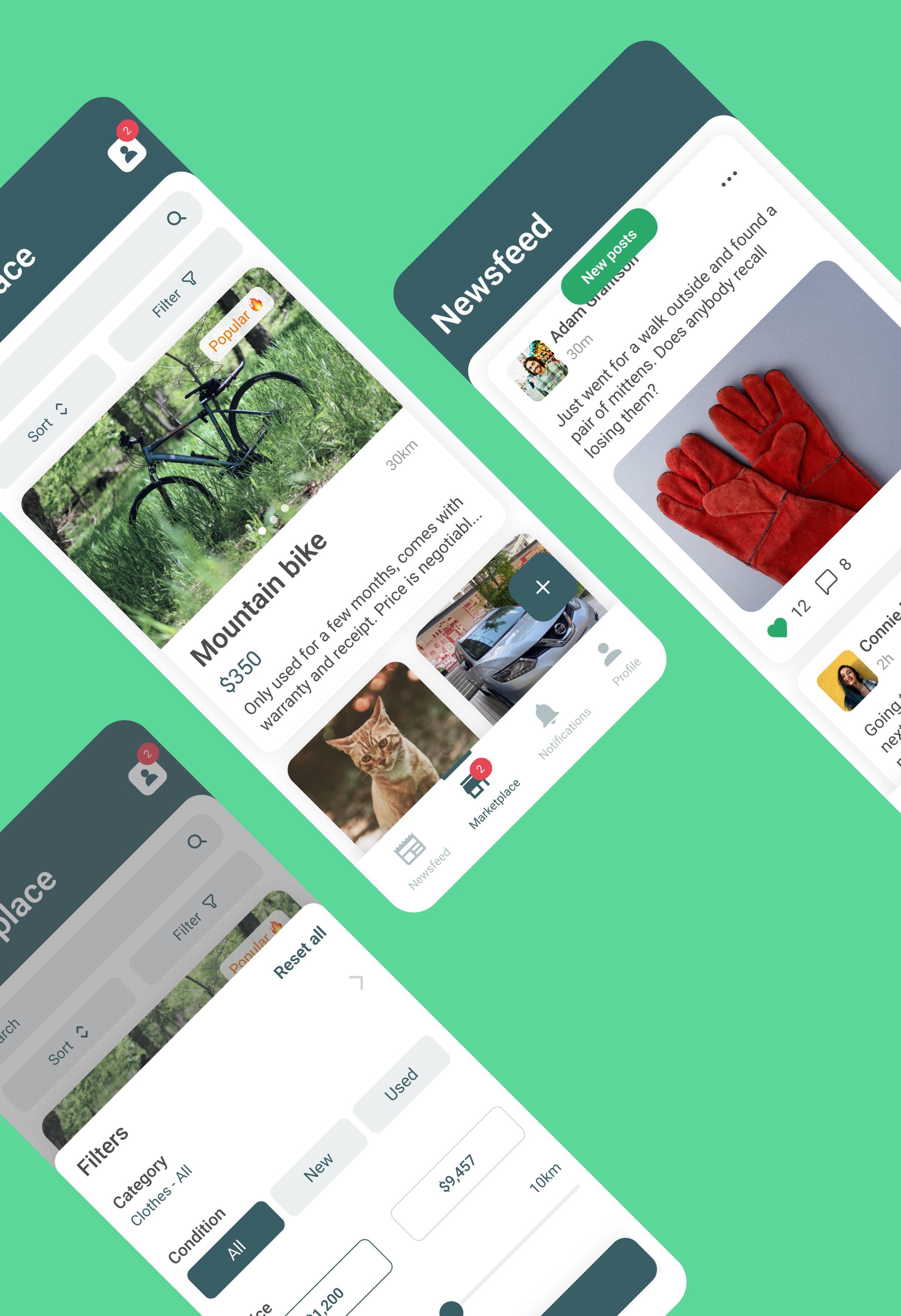
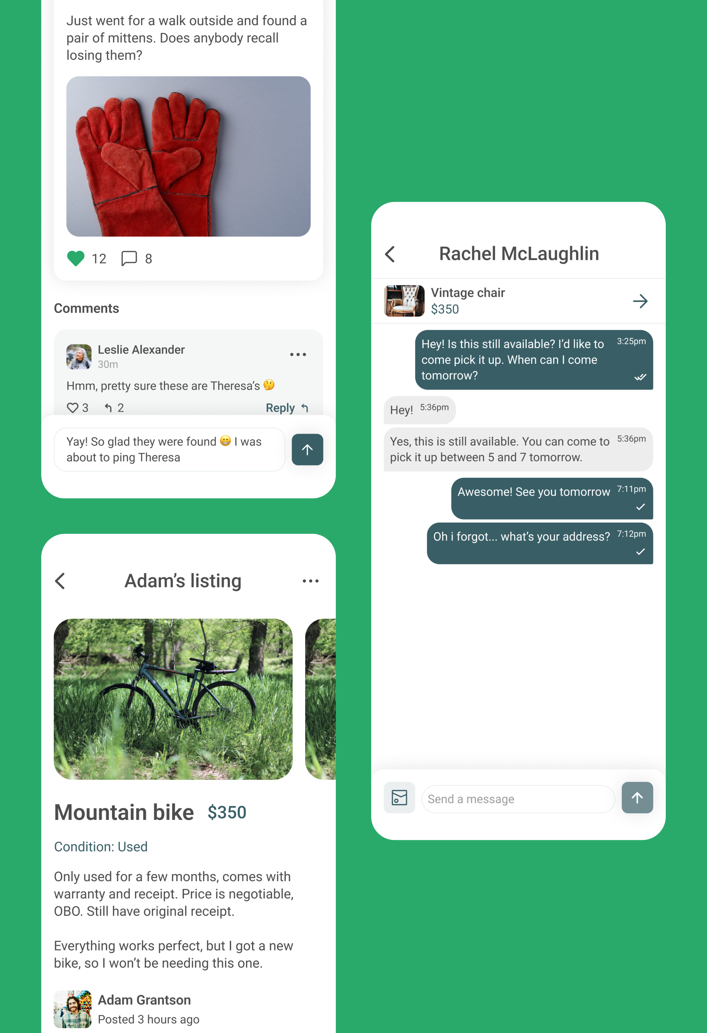
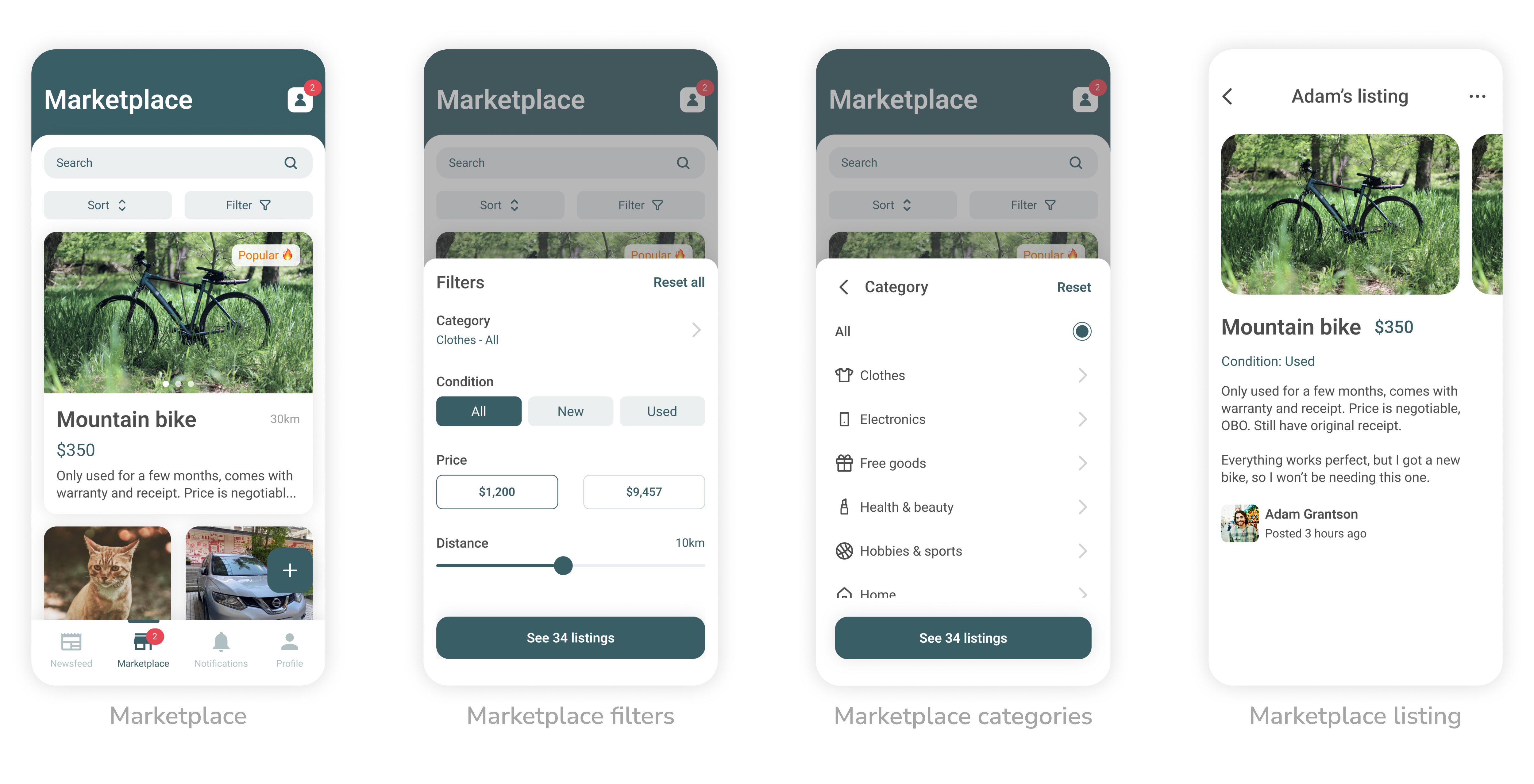
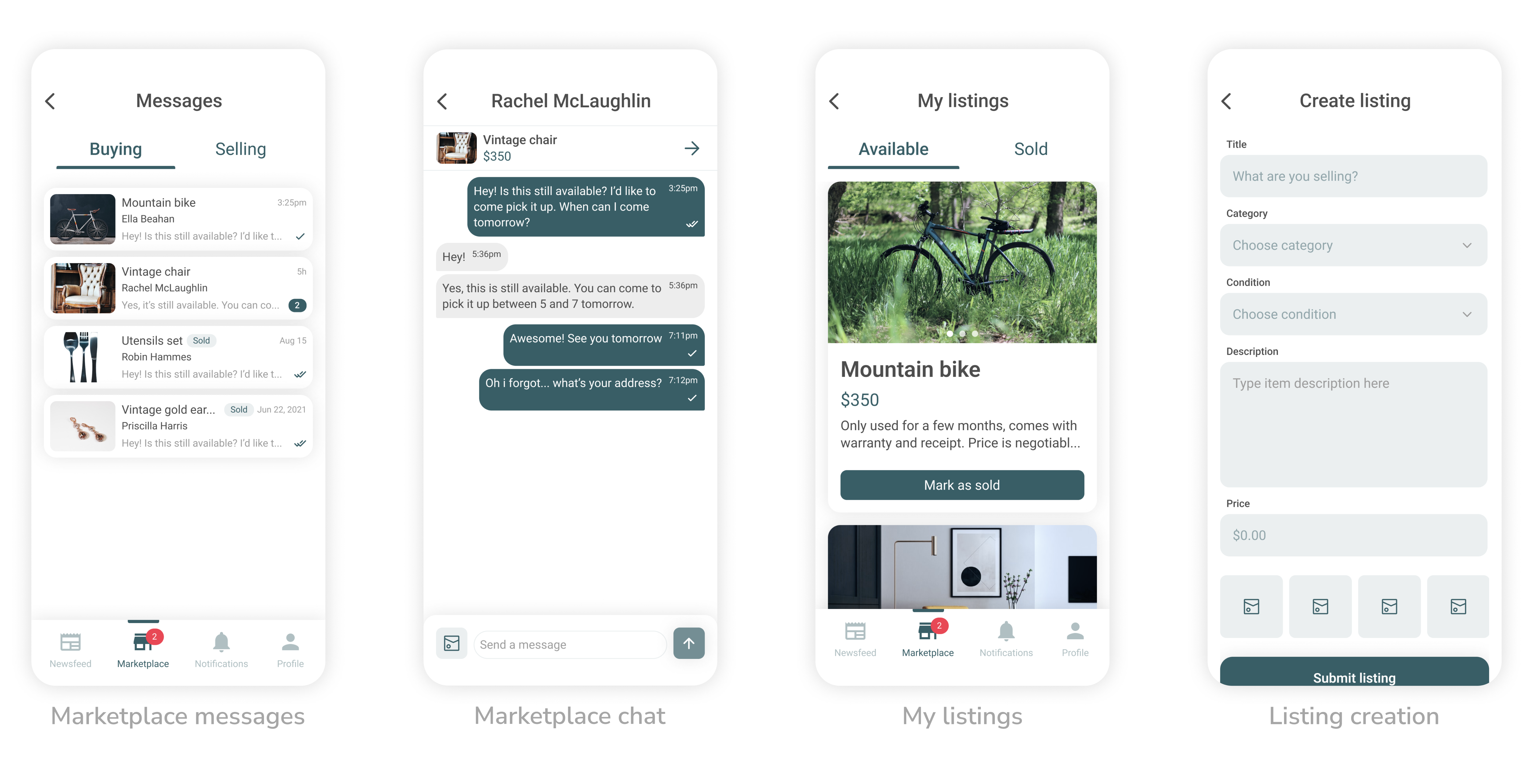
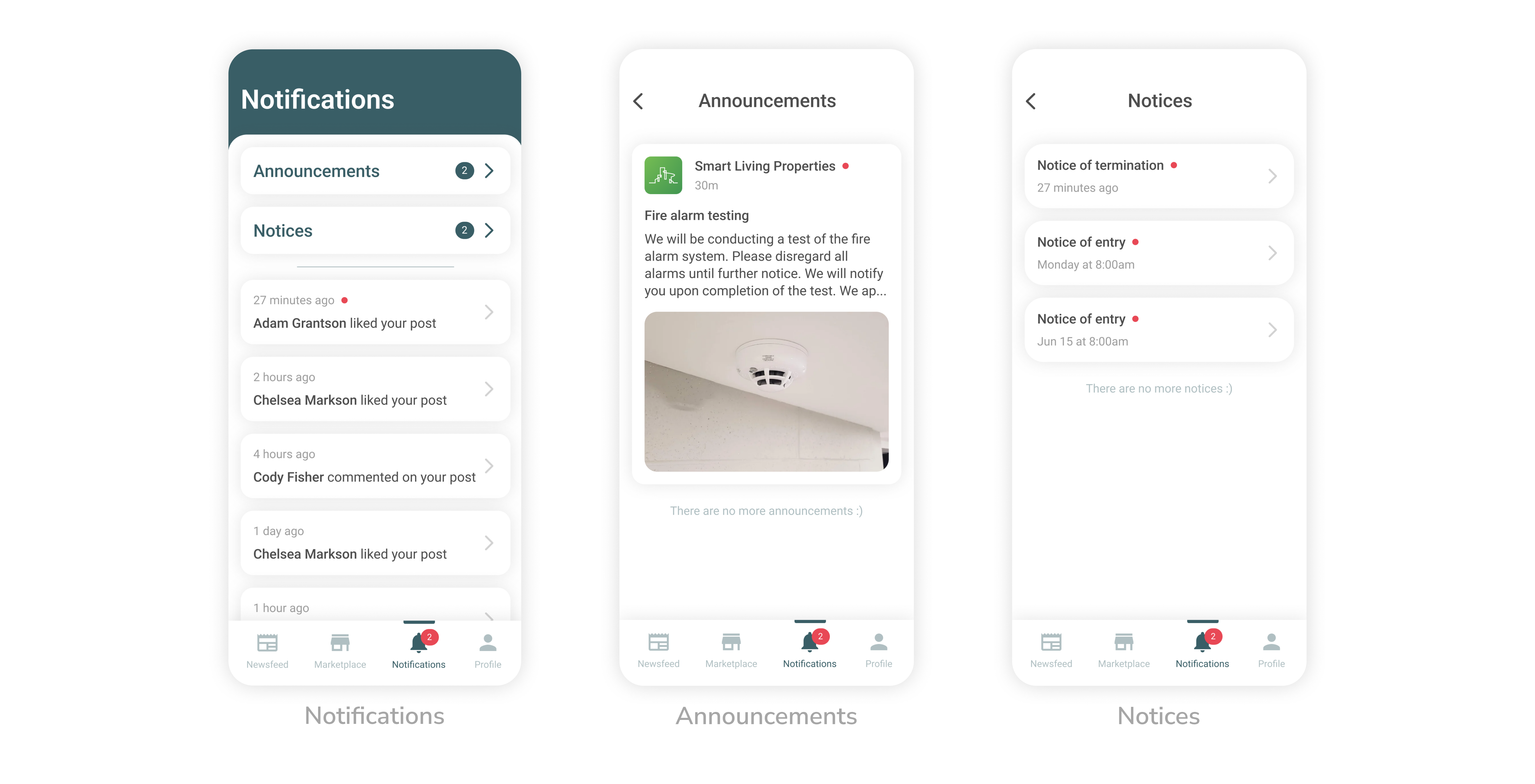
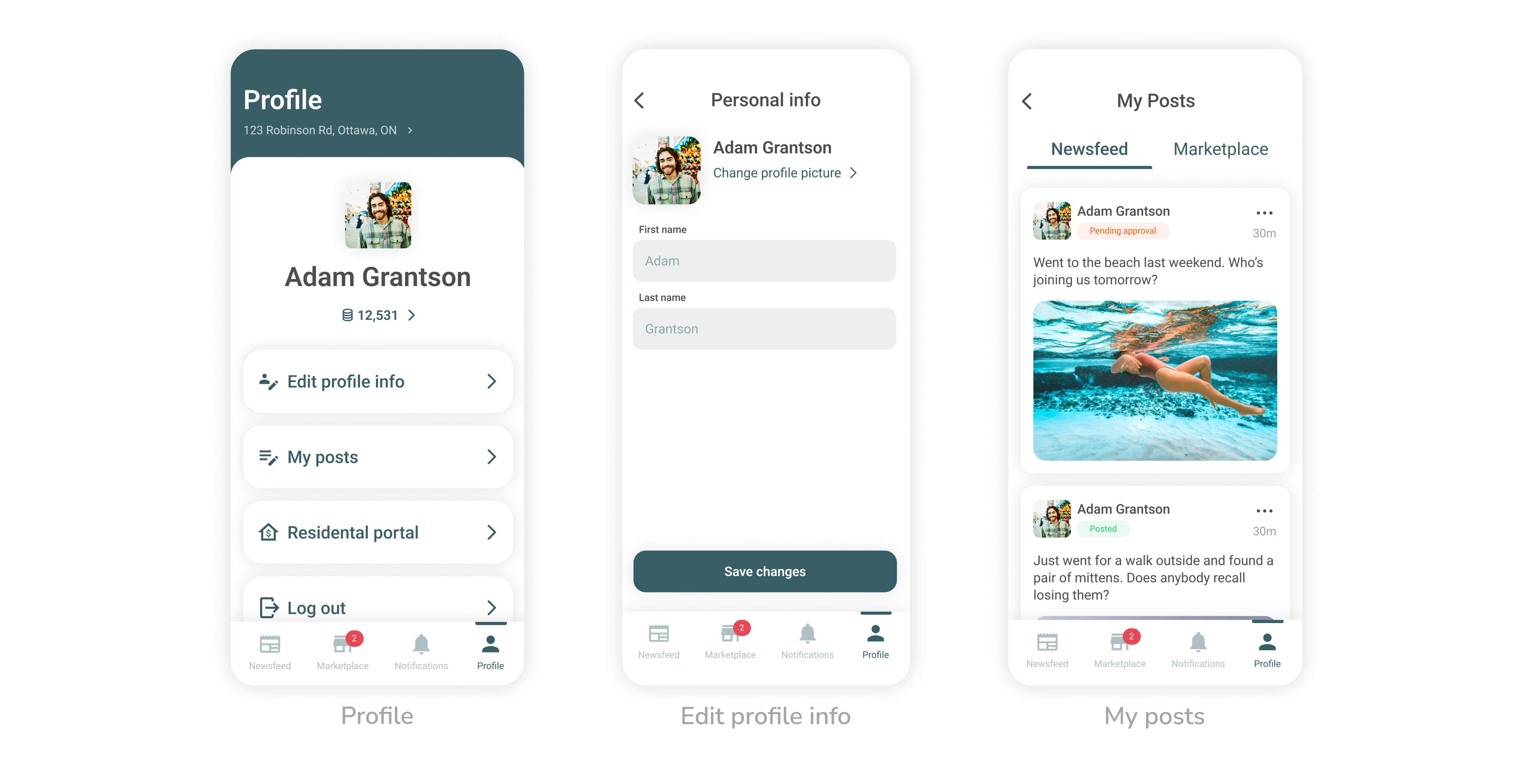
Our mission was to address this challenge by creating a platform that fosters a genuine feeling of home and encourages active engagement among tenants, as currently, Smart Living Properties has 200+ properties around Ottawa with thousands of tenants. It was paramount that the application focused on accessibility, inclusiveness, and a simplistic design to be usable by a wide range of users. The app includes features like newsfeed and marketplace to encourage tenant engagement, as well as simplified and fast communication with building management.
❌ Constraints
The app had to work seamlessly on both iOS and Android. The client specifically requested the platform to feature one or more of their brand colours. These are the brand colours I was choosing from.

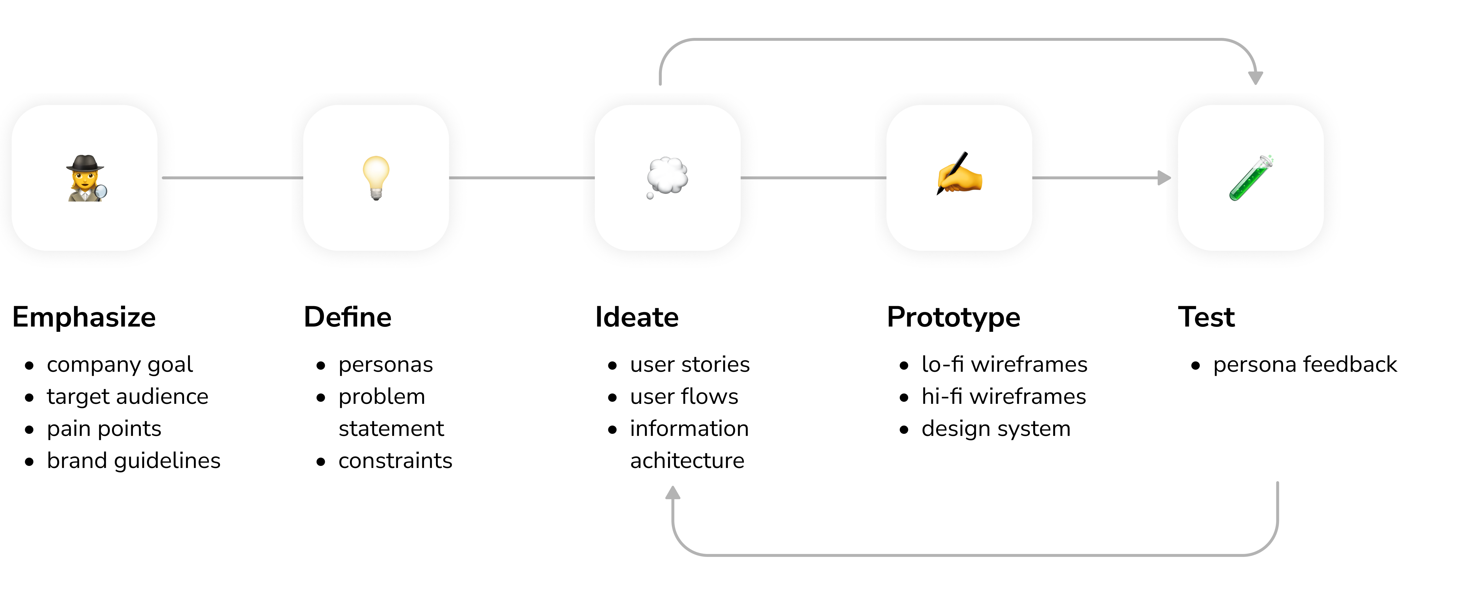
🔄 Process
📄 User Research Summary
I interviewed 35 people who are currently renting or have been previously renting an apartment, to identify their pain points and needs. Upon gathering and analyzing their responses to our survey, I identified the desired features. Those features included rent payments, marketplace to buy and sell within the community, newsfeed and announcements to stay up to date with the current community event, and a possibility to submit maintenance requests.
👩 User Persona
To better understand the potential users, I conducted user surveys, and asked them questions to identify the target demographics, as well as their experience renting an apartment/house. I ended up creating this user person:
Name: Julia
Age: 28
Location: Ottawa, ON, Canada
Occupation: Government worker
Bio:
Julia, a tech-savvy individual in her late twenties, recently made the exciting leap to Ottawa, Canada. However, she faces a common challenge for newcomers—she's struggling to find her footing and establish meaningful connections within his new city. In her spare time, Thomas immerses herself in the world of technology, keeping up with the latest gadgets and digital trends. Leveraging her tech skills, she hopes to discover innovative ways to overcome her social hurdles and form lasting bonds within the community.
Goals:
- Feeling more engaged within community
- Handling rent payments in a more convenient way
- Stay up to date with the building’s news
Frustrations:
- Not having a mobile app to pay rent and receive updates from his building’s staff
- Having to fill out a paper application to submit a maintenance request
- Having to call building management instead of chatting online
- Not knowing what’s happening in the community
🔀 Information Architecture
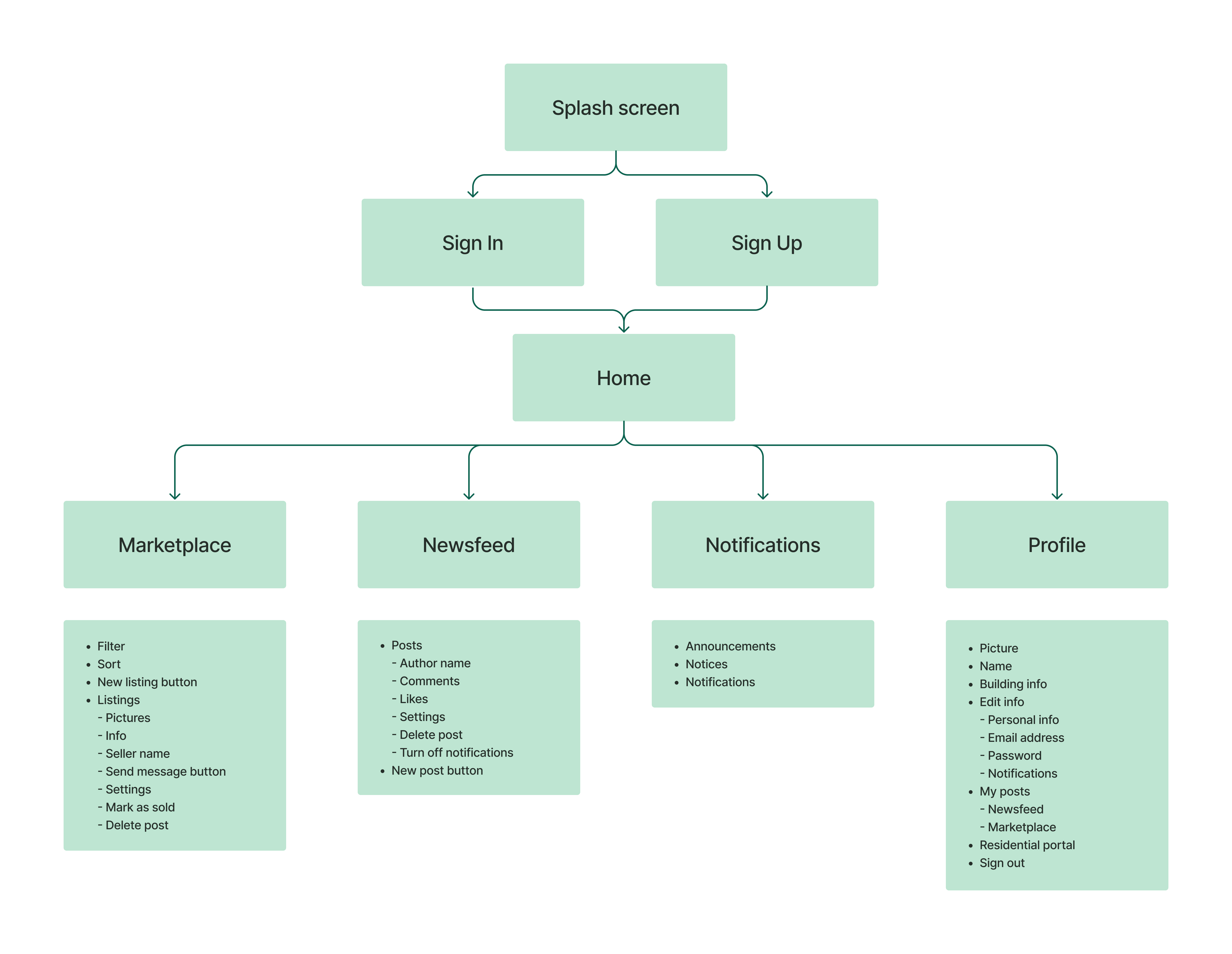
Before sketching out potential layout of the UI, I planned the structure and hierarchy of the application.
✍️ Wireframes
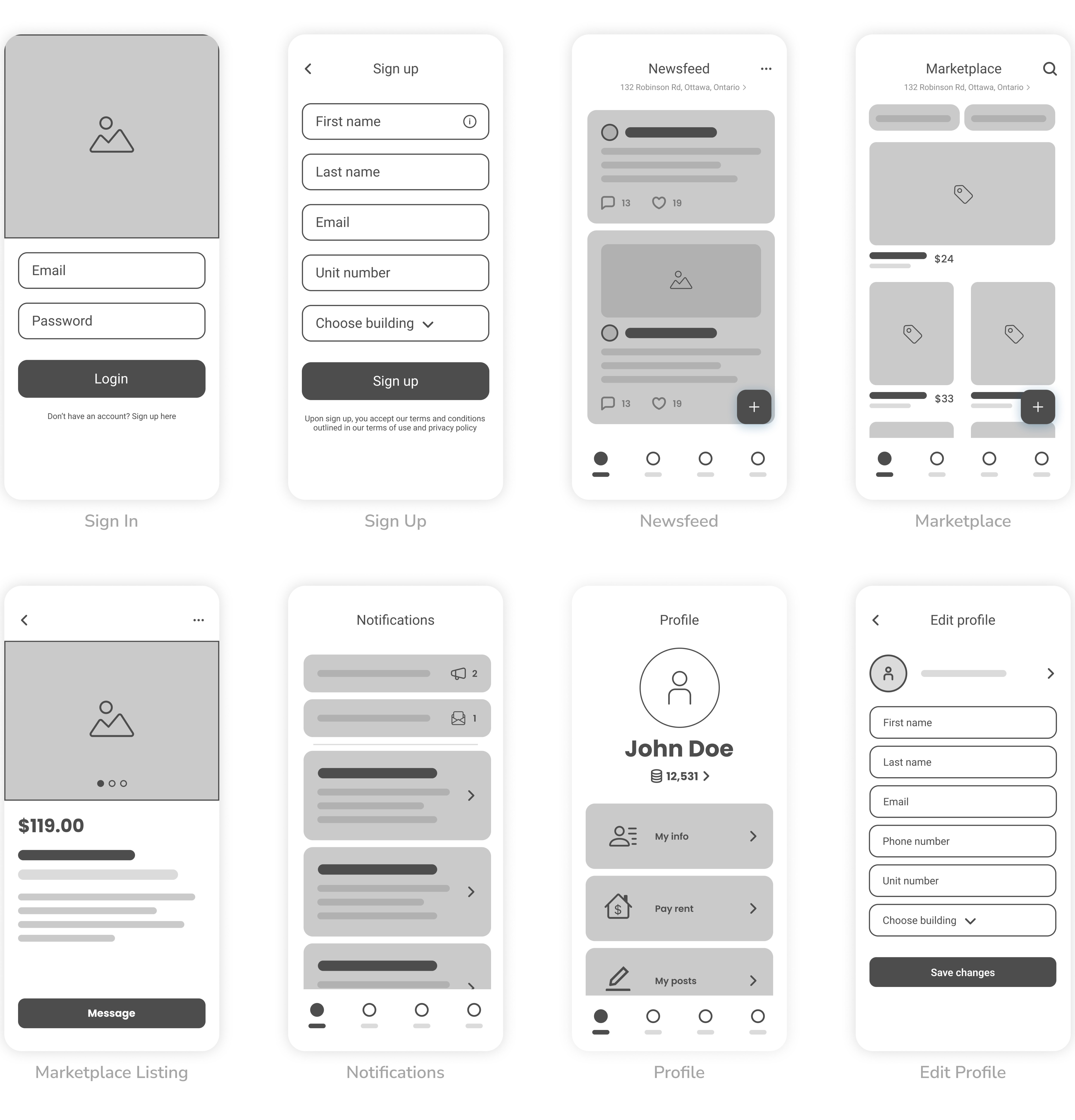
After the structure has been planned, I proceeded to create initial wireframes of the app to visualise the potential layout for our client.
🖼 Visual design
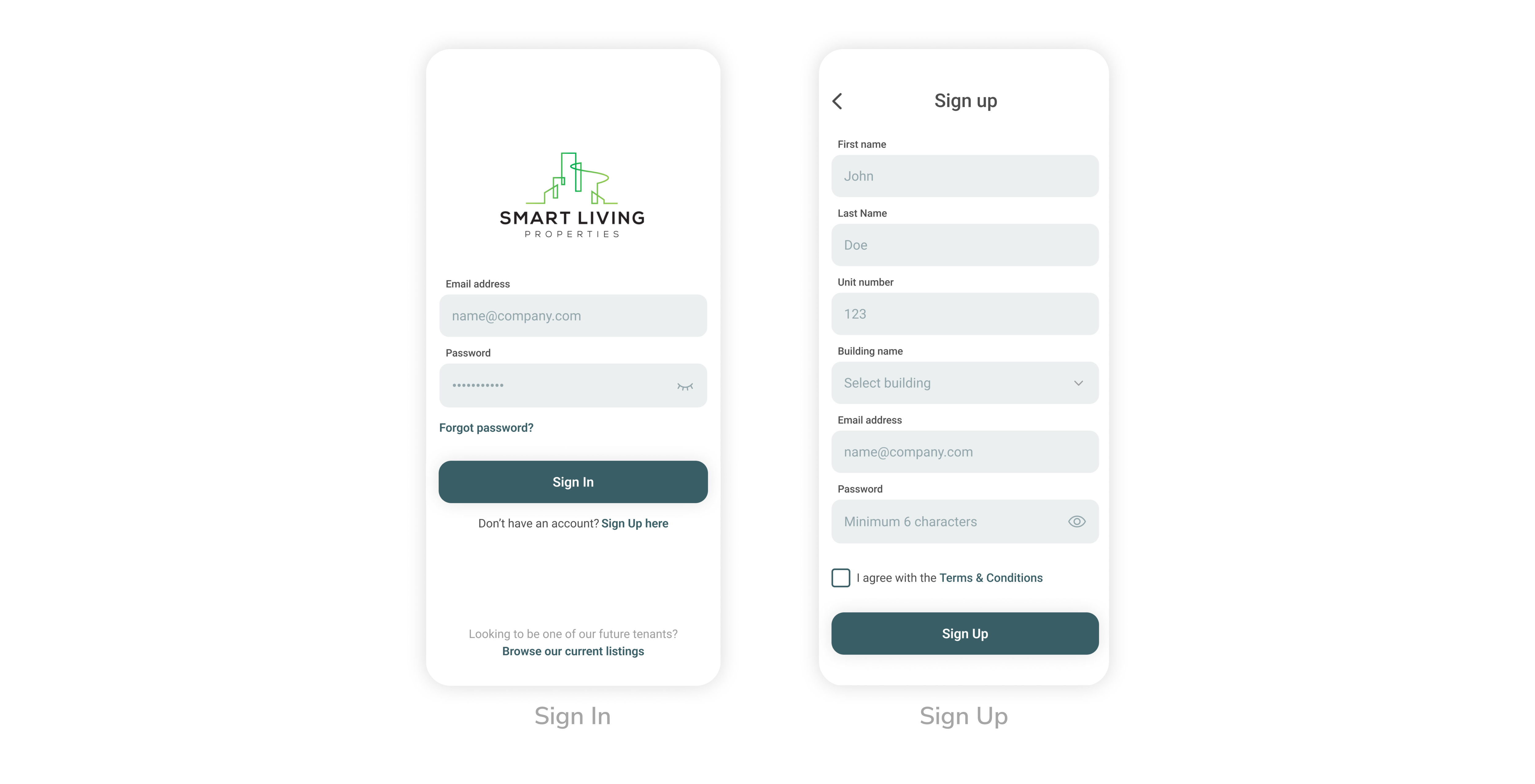
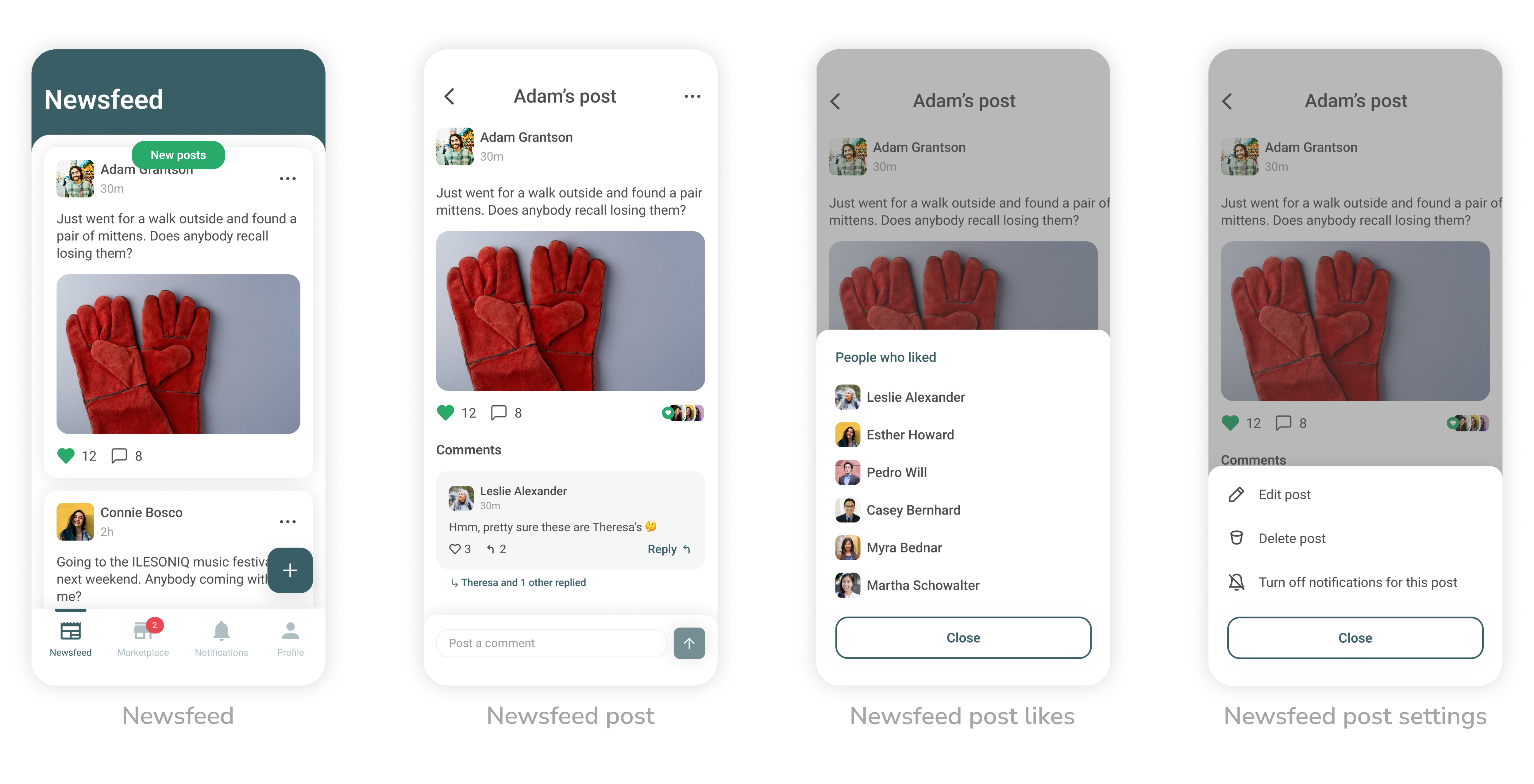
Finally, after the wireframes have been approved by the client and the dev team, I proceeded to “dress up” the app using the client’s branding colors.
📱 Icon Design
As the app was being uploaded to the App Store and Google Play Store, I prepared a set app's icons that comply with the stores' requirements.
🧪 Usability Testing
Due to internal client issues, the project has been frozen and usability testing has not been conducted.
🥇 Product Success
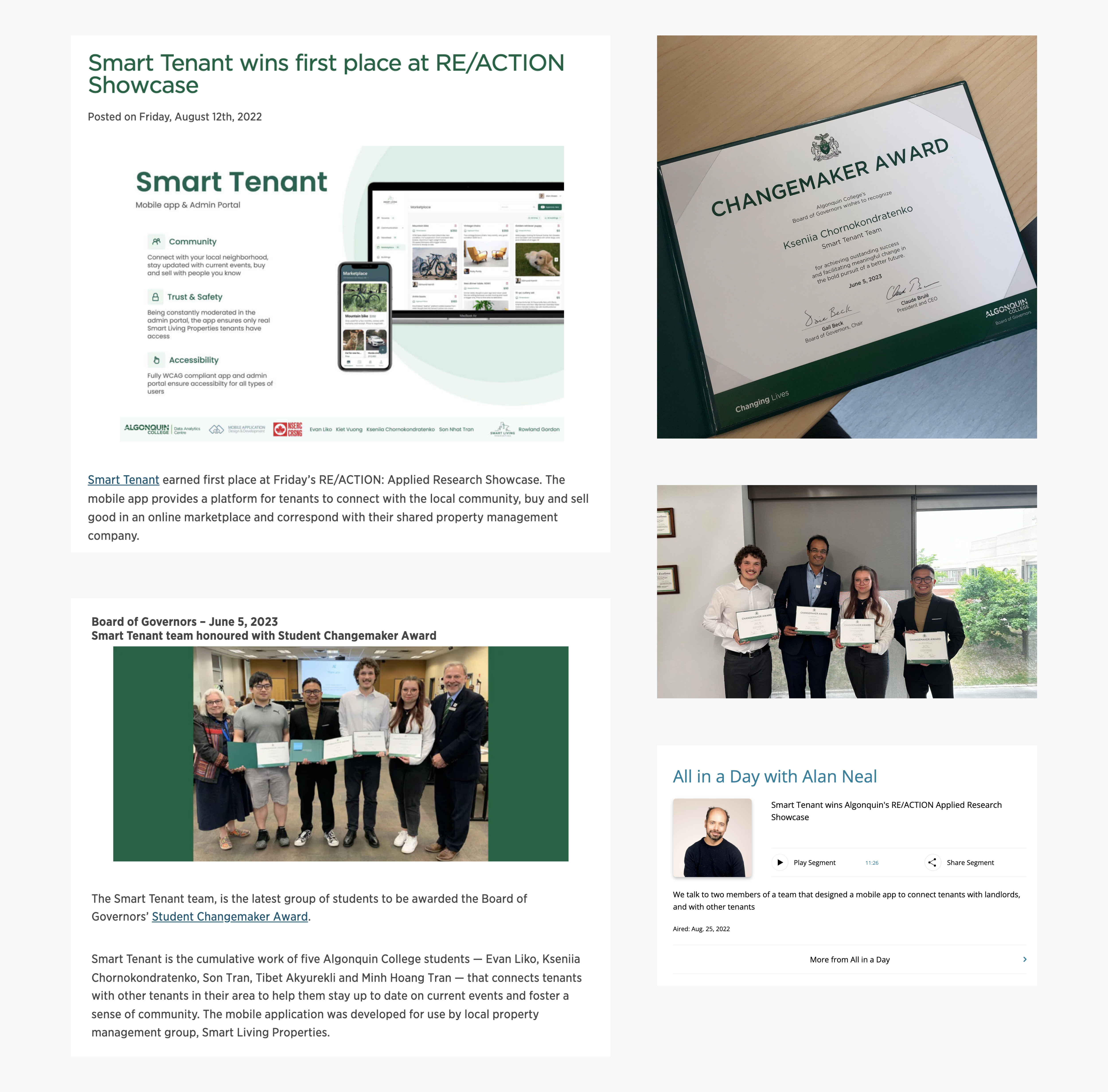
Smart Tenant earned first place at RE/ACTION: Applied Research Showcase twice – in April 2022 and August 2022. Hosted by the Office of Applied Research, Innovation & Entrepreneurship (ARIE) of Algonquin College, the goal of RE/ACTION is to create a platform for students to showcase their hard work to an audience of their peers, faculty and community partners. This has brought media attention to the Smart Living Properties business and the app was featured in the CBC radio program “All in a Day with Alan Neal” . Additionally, the Smart Tenant team has been awarded the Algonquin College Board of Governors Changemaker Award.
📝 What I learned
Being the driving force behind the entire lifecycle of the Smart Tenant project, I gained invaluable knowledge through hands-on experience and learned from the challenges I encountered along the way. Through a close collaboration with the development team, I gained a valuable insight into the intricacies of designing for both iOS and Android platforms. This experience revealed a noteworthy lesson: the technical constraints and unique characteristics of each platform can result in visual discrepancies, which require careful consideration during the design process. Moreover, as the app was destined for upload on both the AppStore and Google Play Store, I had the opportunity to delve into their respective requirements. This allowed me to not only design the app in accordance with comprehensive accessibility guidelines but also diligently prepare all the supporting materials to upload the app to the stores.
